DataGrid
Description
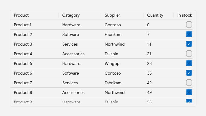
DataGrid extends the WPF DataGrid with Fluent row, cell, header, and group styles. It is the Fluence counterpart of the WinUI 3 TableView and keeps the WPF API names, so native columns, sorting, resizing, reordering, frozen leading columns, editing transactions, validation, grouping, filtering, and row virtualization work as they do in WPF.
Use it for tables of bound data that people sort, group, filter, or edit.
Example usage
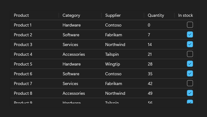
Declare the columns and bind each one to a property of the row objects. A header click sorts by that column, a header edge resizes it, and FrozenColumnCount keeps the leading columns in place while the grid scrolls sideways.
- XAML
- C#
<fluence:DataGrid
    x:Name="ProductsGrid"
    Height="320"
    AutoGenerateColumns="False"
    FrozenColumnCount="1"
    IsReadOnly="True">
    <fluence:DataGrid.Columns>
        <DataGridTextColumn Width="160" Binding="{Binding Name}" Header="Product" />
        <DataGridTextColumn Width="140" Binding="{Binding Category}" Header="Category" />
        <DataGridTextColumn Width="100" Binding="{Binding Quantity}" Header="Quantity" />
        <DataGridCheckBoxColumn Width="100" Binding="{Binding InStock}" Header="In stock" />
    </fluence:DataGrid.Columns>
</fluence:DataGrid>
// Product is an application class with Name, Category, Quantity, and InStock properties.
ProductsGrid.ItemsSource = new ObservableCollection<Product>
{
    new Product { Name = "Laptop", Category = "Hardware", Quantity = 12, InStock = true },
    new Product { Name = "Support plan", Category = "Services", Quantity = 0, InStock = false },
};
Key properties
| Property | Default | Purpose |
|---|---|---|
IsItemSelectable | true | Allows row and cell selection. false is the equivalent of WinUI SelectionMode="None". |
EmptyContent | null | Content shown over the grid while it has no rows. |
CornerRadius | 4 (ControlCornerRadius) | Rounds the grid's outer border. |
GridLinesVisibility | Horizontal | Inherited; the Fluent style shows horizontal lines only. |
HeadersVisibility | Column | Inherited; the Fluent style hides row headers. |
FrozenColumnCount | 0 | Inherited; keeps leading columns in view while scrolling sideways. |
State and behavior
Columns and sorting
DataGridTextColumn and DataGridCheckBoxColumn columns that do not set an ElementStyle or EditingElementStyle receive the Fluent display and editing styles, so a column that sets its own style keeps it. Use DataGridTemplateColumn for other content, and set SortMemberPath so a header click can still sort it:
<DataGridTemplateColumn Width="Auto" Header="Rating" SortMemberPath="Rating">
    <DataGridTemplateColumn.CellTemplate>
        <DataTemplate>
            <fluence:RatingControl VerticalAlignment="Center" IsReadOnly="True" Value="{Binding Rating}" />
        </DataTemplate>
    </DataGridTemplateColumn.CellTemplate>
</DataGridTemplateColumn>
DataGridComboBoxColumn and DataGridHyperlinkColumn have no Fluent styles. For a Fluent drop-down cell, use a DataGridTemplateColumn with a Fluence ComboBox. Only leading columns can be frozen; trailing frozen columns and the WinUI Density option are not provided.
Grouping and filtering
Group and filter rows through an ICollectionView. When the grid loads with an empty GroupStyle, it adds a group style with a Fluent collapsible header. ExpandAllGroups and CollapseAllGroups open or close every realized header of this grid that uses the Fluent header; groups in a grid nested in a cell or the row details are left as they are.
var view = new ListCollectionView(products);
view.GroupDescriptions.Add(new PropertyGroupDescription(nameof(Product.Category)));
GroupedGrid.ItemsSource = view;

// Call from a search box's TextChanged handler.
void ApplyFilter(string filterText) =>
    view.Filter = filterText.Length == 0
        ? null
        : item => ((Product)item).Name.IndexOf(filterText, StringComparison.OrdinalIgnoreCase) >= 0;

// Call from an Expand all or Collapse all button.
GroupedGrid.ExpandAllGroups();
GroupedGrid.CollapseAllGroups();
Set an application group style before the grid loads, usually in XAML. A group style added later applies only to the second grouping level and below, because the Fluent header already holds the first slot.
As in native WPF, grouping turns off row virtualization unless VirtualizingPanel.IsVirtualizingWhenGrouping is set, so a large grouped source realizes every row. Opt in for large sources:
<fluence:DataGrid
    x:Name="GroupedGrid"
    AutoGenerateColumns="False"
    VirtualizingPanel.IsVirtualizingWhenGrouping="True" />
Editing and validation
When IsReadOnly is false, a double-click, F2, or typing begins editing a cell; Enter commits and Esc cancels. Bind the grid to row objects that implement INotifyDataErrorInfo: an invalid value shows the Fluent error outline with the error message as its tooltip, and the row shows an error indicator. A failed commit keeps the editor open. Handle CellEditEnding and RowEditEnding to react to committed or cancelled edits.
<fluence:DataGrid
    x:Name="EditableGrid"
    AutoGenerateColumns="False"
    CanUserAddRows="False"
    CellEditEnding="EditableGrid_CellEditEnding"
    RowEditEnding="EditableGrid_RowEditEnding">
    <fluence:DataGrid.EmptyContent>
        <TextBlock Foreground="{DynamicResource TextFillColorSecondaryBrush}" Text="No products." />
    </fluence:DataGrid.EmptyContent>
    <fluence:DataGrid.Columns>
        <DataGridTextColumn Width="2*" Binding="{Binding Name}" Header="Product" />
        <DataGridTextColumn Width="*" Binding="{Binding Quantity}" Header="Quantity" />
        <DataGridCheckBoxColumn Width="*" Binding="{Binding InStock}" Header="In stock" />
    </fluence:DataGrid.Columns>
</fluence:DataGrid>
Empty state
EmptyContent appears over the grid while it has no rows. On an editable source, set CanUserAddRows to false; otherwise the new-item row counts as a row and the empty content stays hidden.
Selection
Setting IsItemSelectable to false clears the selection and suppresses the hover and selection visuals. Cells stay focusable, so keyboard navigation works, and F2 or typing still begins editing. A mouse click does not begin editing, because the native cell starts a click edit only when it is selected. A click briefly selects the row or cell and then clears it, so SelectedCellsChanged, and SelectionChanged when whole rows are selected, report a selection and then its removal. With row selection, a two-way SelectedItem binding sees a transient value.
Grid lines across theme changes
A frozen SolidColorBrush assigned to HorizontalGridLinesBrush or VerticalGridLinesBrush reads back as a grid-owned copy with the same color. This keeps an open cell edit when the theme or accent changes.
Events
Use the inherited WPF events: SelectionChanged and SelectedCellsChanged report selection, Sorting reports a header sort, and CellEditEnding and RowEditEnding report the end of an edit.
Styling
The Fluent styles are keyed resources, so a native WPF DataGrid keeps its own look; the Fluence DataGrid style applies them. After ApplicationThemeManager.Apply, base a custom style on a key, for example <Style TargetType="DataGridCell" BasedOn="{StaticResource DataGridCellStyle}">, and assign it to the matching grid or column property.
| Key | Target | Used for |
|---|---|---|
DataGridCellStyle | DataGridCell | CellStyle |
DataGridRowStyle | DataGridRow | RowStyle |
DataGridColumnHeaderStyle | DataGridColumnHeader | ColumnHeaderStyle |
DataGridColumnHeadersPresenterStyle | DataGridColumnHeadersPresenter | The column header row |
DataGridColumnHeaderGripperStyle | Thumb | Column header resize gripper |
DataGridRowHeaderStyle | DataGridRowHeader | RowHeaderStyle |
DataGridRowHeaderGripperStyle | Thumb | Row header resize gripper |
DataGridSelectAllButtonStyle | Button | Select-all corner, visible when HeadersVisibility is All |
DataGridValidationErrorTemplate | Control template | Validation outline for cell text |
DataGridTextColumnElementStyle | TextBlock | Text column display element |
DataGridTextColumnEditingElementStyle | TextBox | Text column editor |
DataGridCheckBoxTemplate | CheckBox template | Compact check box in check box columns |
DataGridCheckBoxColumnElementStyle | CheckBox | Check box column display element |
DataGridCheckBoxColumnEditingElementStyle | CheckBox | Check box column editor |
DataGridGroupItemStyle | GroupItem | Fluent collapsible group header |
Related
- WinUI parity and differences
- Known issues: native grid behavior
- Bind PowerShell objects to a DataGrid