Changing theme, accents and backdrop
Start with the window from Basic Usage, then add a theme selector and accent buttons using the manager calls below. Set FluenceWindow.SystemBackdropType on the window when the user chooses a backdrop; changing the manager's backdrop request alone does not change that per-window property.
The theme manager publishes resources into Application.Current.Resources. Apply a theme before showing the first window. Use dynamic resources in XAML so already-open controls update when resources are republished.
Follow Windows
ApplicationThemeManager.Apply(ApplicationTheme.Auto);
Auto resolves the Windows app theme on each apply. A FluenceWindow watches system settings after it opens. If you use a standard WPF Window, register one watched window and unregister it when you no longer need the watcher:
SystemThemeWatcher.Watch(window);
// Later:
SystemThemeWatcher.UnWatch(window);
Select a theme or accent
ApplicationThemeManager.Apply(ApplicationTheme.Dark, WindowBackdropType.Mica);
ApplicationAccentColorManager.ApplyCustomAccent(
    System.Windows.Media.Color.FromRgb(0x00, 0x78, 0xD4));
ApplyCustomAccent pins the accent until ApplySystemAccent() returns to the live Windows palette. An overload accepts separate light and dark seeds; high contrast follows the dark seed. A theme apply alone already uses the system accent when no custom accent has been selected.
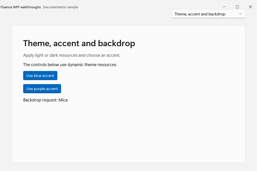
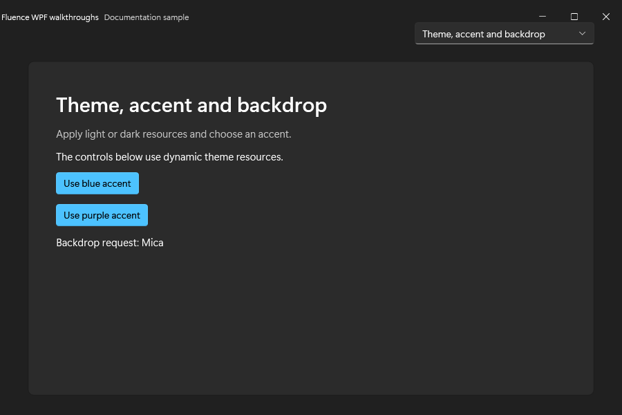
The demo window with theme, accent, and backdrop options:
React to changes
ApplicationThemeManager.Changed is raised by ApplicationThemeManager.Apply when it publishes a changed resource set or changes the requested theme or backdrop. An accent-only apply does not raise this event. ApplicationAccentColorManager.AccentColorChanged is raised after any theme-engine resource publish, including a theme-only publish. A duplicate apply whose published output is unchanged raises no publish event.
Use these events only for state that cannot be expressed through resources. For a brush or color, bind a published brush key:
<Border Background="{DynamicResource CardBackgroundFillColorDefaultBrush}" />
The theme resource reference lists supported keys. The theme pipeline explains publishing and duplicate-change handling.