Use inputs and data controls
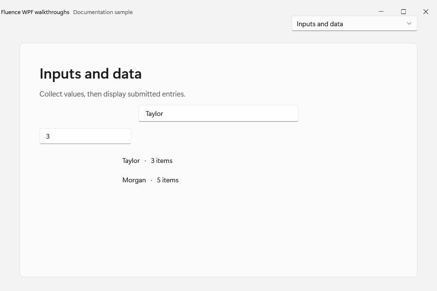
Build a small form with a name, quantity, and a collection of submitted entries. Begin with the Basic Usage window and add the input controls below; use WPF binding for the collection displayed in a ListView.
Most Fluence controls extend the WPF control with the same name. They keep familiar bindings and commands while their templates use the Fluence resource palette. Add xmlns:fluence="http://schemas.fluencewpf.com" to the XAML root, and initialize the theme before showing the window.
Choose an input
| Task | Control | Main API |
|---|---|---|
| Enter text | fluence:TextBox | WPF Text, PlaceholderText |
| Enter a secret | native PasswordBox | Password, PasswordBoxExtensions attached properties |
| Search suggestions | fluence:AutoSuggestBox | Text, ItemsSource, QuerySubmitted, SuggestionChosen |
| Enter a number | fluence:NumberBox | Value, ValueChanged |
| Choose one item | fluence:ComboBox | WPF selection and items APIs |
| Choose date or time | fluence:DatePicker, fluence:TimePicker | SelectedDate, SelectedTime |
| Choose a color | fluence:ColorPicker | Color, ColorChanged |
System.Windows.Controls.PasswordBox is sealed, so Fluence styles that native type and adds its extra behavior through PasswordBoxExtensions. Write <PasswordBox /> in XAML. The Fluence DatePicker is a separate three-column picker, not a subclass of WPF's calendar DatePicker; adapt bindings when moving between them.
<StackPanel xmlns="http://schemas.microsoft.com/winfx/2006/xaml/presentation"
            xmlns:fluence="http://schemas.fluencewpf.com">
    <fluence:TextBox Width="240" PlaceholderText="Display name" />
    <fluence:NumberBox Width="160" PlaceholderText="Quantity" />
    <PasswordBox Width="240" />
</StackPanel>
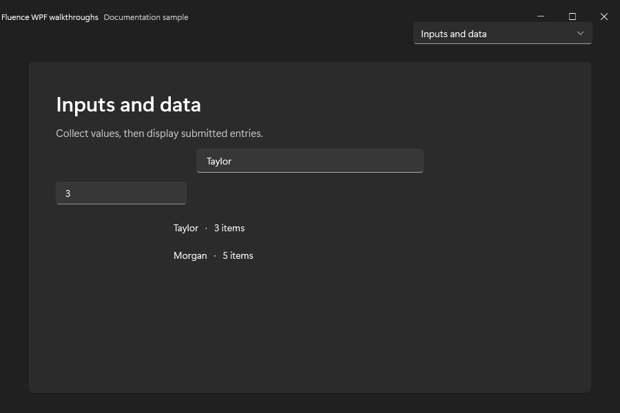
The form and data list in both themes:
Display collections
Use fluence:ListBox and fluence:ListView with ItemsSource, ItemTemplate, and the WPF selection APIs. ListView.ItemsLayout selects the library's list or grid layout behavior; see its XML API comment for supported values. Use fluence:TreeView for hierarchical data and TreeView.SelectedItems when multiple selection is enabled. The data binding gallery demonstrates collection updates and templates.
fluence:Card is a ContentControl. Set IsClickable="True" to enable its Click event. A card can also group content without handling clicks.
Account for similarly named types
fluence:TextBlock is a ContentControl with text properties; it does not provide the native TextBlock.Inlines collection. fluence:Image is a templated Control that supports rounded clipping, not a subtype of the native WPF image. Use the WPF versions where a typed API or inline collection specifically requires them.
For more examples, run the gallery and visit Inputs, Forms, Data, Data binding, and Trees. The catalog lists every public control.